Wednesday, February 15, 2017

Monday, December 26, 2016

Pastel of a friend's puppy


                                    Sold
His name is "Chewy Einstein MacNoodle" but called Mac. He is an adorable bright eyed powder puff as seen in his pastel and as sweet as he is cute. I think I have captured his fun playfulness with colorful strokes.

Friday, August 9, 2013

Pastel Painting of an Italian Square


My intent was to render the building and square with care, while having fun with a whimsical use of color. My hope was to create an interesting combination of realism and fantasy. Opposites can be unexpected, powerful and pleasing.

Friday, April 13, 2012

Pastel Painting of a Portuguese Water Dog


I have a smart, rescued Portuguese Water Dog. She has been an expressive, playful joy for the last 8 years and the inspiration for painting a Portuguese pup. This one is in lots of color to suggest her energy and my delight.

Tuesday, March 20, 2012

A Pastel Painting of a Colorful Cat


Creativity is a dynamic, interactive process. With a simple, undeveloped concept as my jumping off point, ideas occur to me as I am working. The process is the creative engine. Creativity spills into unexpected areas and enriches. Getting started is everything as one idea leads to another, and it is fun.

Saturday, March 10, 2012

Pastel Painting of a Cat


I had a fearless 10 pound cat who ruled us all including my 90 pound Afghan hound.

I wanted my fearless pastel kitten to have the playful, energetic and expressive look we associate with kittens. Strokes of red, orange, pink and yellow suggest heightened energy and emotion.

The color green is the complement to the color red on the color wheel. By their juxtaposition each color is contrasted and becomes brighter, more vivid. My kitten stands out while framed by the similarly colored joints.

My inspiration for using strong complementary colors are Marc Chagall's Adam and Eve Expelled from Paradise, Song of Songs III and Jacobs's Ladder.

The fanciful green of the floor boards was chosen as a repeat of the green in the cat’s eyes to enhance their visual presence. My kitten is looking right at you.

Monday, February 20, 2012

Pastel Painting of an Afghan Hound


Afghans are sight hounds. They seem to be always looking off into the distance right past you. I know this because I had one for a wonderful thirteen years. The show dogs are elegant and perfectly groomed with beautiful flowing coats. They come in all colors. So my pastel Afghan is in many colors with the idealized flowing coat and looking just past you too.

Saturday, February 4, 2012

Pastel Painting of a Cocker Spaniel Puppy


                                  sold
This is a painting of my neighbor’s favorite picture of her rescued cutie named Valiant. I too have a rescued puppy. We will never know what they have been through. They know they are safe now and that is very nice for us all.

Of course this is a colorful version of Valiant who is part cocker. The intent is to duplicate his cuddly look, bright eyes and show his curls as swirls in beiges, yellows, oranges and reds. He is shaped using blue and green strokes. The white bib is expressed in white, beige and blue to keep it fresh and clear in contrast to the rest of his warm-colored coat. I had colorful fun with the bottoms of his back paws that are just peeking though. The vibrant image is set off and cooled by the blue floor boards. The colorful joints are used to frame him and repeat his colors.

This was a lot of fun to do. Do you have a favorite picture of a puppy you would like rendered in lots of color? Contact me for information

Friday, December 9, 2011

Pastel Painting of a Yorkshire Terrier Puppy


Vivid, colorful strokes are used to create a particularly playful image of a Yorkshire Terrier puppy. A red planked floor with colored joints sets off the puppy and reinforces the playful quality of the whole.

The expressive and visual power of red is exemplified by two of Henri Matisse's paintings; The Roofs of Collioure, 1905, and Large Red Interior, 1948. Another example is Marc Chagall's Big Sun.

Wednesday, November 23, 2011

Pastel Painting of a Colorful Maltese Puppy


Art means different things to different people. I love color and the creative interplay of colors, textures and patterns. Flowers are beautiful color expressed in pleasing patterns. For me color expresses joy, freshness and exuberance. Since puppies have these qualities, I decided to paint a colorful pup.

I was sitting with a friend who has an irrepressible white Maltese puppy. White is made up of all colors. So my Maltese is shaped by colorful strokes and set against a blue floor with colorful joints to highlight the dog while making an integrated visual design.

Marc Chagall used blue to contrast and set off bright, colorful and expressive images. Three wonderful examples are Horsewoman on a Red Horse, 1966, Child with a Dove and On Two Banks, 1957.


Sunday, November 13, 2011

Pastel Painting of a Ballerina on Stage


A ballerina is a very “painterly” subject. A ballerina is expressive. Her costume is a great opportunity for colorful fun as is the wood floor. I used a pointillist style to suggest a painted landscape stage backdrop. The modeled ballerina becomes the focus against the suggested curtain and floor while at one with both because of the use of complementary color, patterns and texture.

Softer images are brought to life by the lively colors of the Fauvist style. Three examples by Henri Manquin are Model Resting, 1905, Jeanne at the Fountain, Villa Demiere and Morning at Cavalliere, 1906.

Saturday, October 22, 2011

Pastel Painting of a House


For me, color is a joyful experience. It makes little difference to me whether or not a chosen subject was colorful to start. I suppose this is one reason I like Van Gogh so much. Two examples are Van Gogh’s White House at Night, 1890. and The Yellow House, 1888.

Saturday, February 26, 2011

Pastel Painting of a Baby Elephant


Inspired by my first teddy elephant more years ago than I want to admit, this is proof that we never have to lose our sense of fun. Little “Pinky” is a whimsical subject set in a pointillist scene of texture, patterns and color. This is meant to combine a childlike sense of fun and an adult sense of art.

Saturday, July 31, 2010

Pastel Painting of Hot Air Balloons


Each hot air balloon pastel painting has a different theme and therefore a different look.

This pastel is hot air balloons over a river and desert. The images are angular and barren with balloon designs also angular and bolder.

In the second painting the balloons are over a field of flowers. The images are softer with balloon patterns also softer more traditional. Scroll to see.

In both paintings the images created are suitable to the theme and create a complementary mood.

Friday, July 2, 2010

Pastel Painting of Colorful Hot Air Balloons


Hot air balloons are a good choice for complementary colored patterns within the balloons themselves as well as created by their positions.

The colorful balloons are both at one with and set off by the complementary colored pointillism sky, clouds and flowered fields.

The repeats of color, pattern and texture are intended to give order and balance to this composition. Interest and emphasis are created by the combination of realistic modeling and whimsical colored patterns and texture. The emphasized horizon adds important depth.

Saturday, May 29, 2010

Pastel Painting of a Colorful Rooster at Sunrise


A fun example of life imitating art. If my little rooster was going to come to life and strut, I hope he would have this much spunk.

Saturday, May 8, 2010

Pastel Painting of a Rooster


I enjoy the visual excitement created by the interplay of vivid colors and complementary, imaginative patterns. Vivid colors have a pleasing freshness. Patterns offer a richness of texture and interpretive opportunities. These are my goals.

Henry Edmond Cross 1856-1910. Work includes inspiring examples of pointillism technique and fauvist style. Some of those are The Blooming Terrace, The Canal near St. Tropez and Provence Landscape.

A rooster is a logical subject. Its feathers are a natural for color and texture.

Marc Chagall's fanciful roosters are wonderful examples of seeing the unique and creative opportunities presented by these everyday subjects. Examples include The Tribe of Naphtali, 1964, The Rooster, 1929, Wedding on the Red Rooster, Yellow Rooster, 1968 and Listening to the Cock, 1944.


Wednesday, December 2, 2009

Pastel Painting of a War Ship


This is a pastel painting of a tall ship firing cannons at sunset. It is colorful, with interpretive, stylized elements and textures framing a more literal, modeled image of a ship.There are repeats of color with different textures and repeats of textures with different colors. The flattened swirls of blue clouds and pointillistic blue water contrast and bring focus to the off-center image of the ship. The shadows add an important touch of depth to the composition. The smoke from cannon fire is suggested by colorful swirls.

This painting was inspired by the Fauvists. Some examples are Andre Derain’s The Fishing Boats, 1905, Georges Braque’s The Yellow Seacoast, 1906, Albert Marquet's Fishing Boats, 1906, and Othon Friesz’s Port of Antwerp, 1906. Maurice de Vlaminck's Sailboats on the Seine, 1906, The Chatou Bridge, 1906 and Masions au bord de la Seine a Chatou, 1906 are more favorites.

Wednesday, October 28, 2009

Villa Albicini Pastel Painting


Pastels are an ideal medium for expressing faux Italian stucco. It is certainly more readily accomplished than this labor intensive painting style with its paint, burlap bags and the time that is needed to soften and meld colors. It takes a very special house to stand up to and complement the faux Italian Stucco look. I moved to a town with a wonderful example of its unique excitement and beauty. This house is artistically satisfying in its own right. Adding color would be “gilding the Lilly”. I did have some fun with color on the gravel drive and in the landscape as an artistic decision to visually tie the color of the house to its surroundings. This house is a treat for the eyes, perfect for pastels and a satisfying subject for me.

Several richly colored houses and landscapes are Chestnut Trees and Farm at Jas De Bouffan, 1888, House with Red Roof, 1887 and House in the Provence, 1883 by Paul Cezanne. Another favorite is Place des Lices St. Tropez, 1904 by Henri Matisse.

Saturday, October 17, 2009

A Colorful Basket Pastel Painting


I love seeing the unique opportunities in every day objects and their compositions. This painting was conceived with the idea of colorful stripes and texture. Fall gourds are naturally striped. Onions and lemons have sections suggesting the opportunity for enhanced color. The basket was another structural opportunity for colorful stripes. The planks of the table and ribbed pot complete the striped theme. The lettuce in the basket is texture. The blue seen through the window is a rich textural blue made up of dots of all colors and lots of variations of blue. Last, I just had fun with colorful highlights on the table because I thought the effect was pleasing. I have saved the whites by using the white background color of the paper as my table top and for highlights on the fruit as a fresh counterpoint to the color of the rest.

Recognize the basket? It is a colorful, fauvist version of the one in Paul Cezanne's Still Life with Fruit Basket, 1880-90. I like knowing that Cezanne also picked elements for his compositions from different sources with the goal of a pleasing painting.

Two particularly colorful Cezanne still life paintings are A Still Life with Apples, Bottle and Milk Pot, 1902-06 and Still Life: Apples, Bottle and Chairback. In the painting with a Milk Pot bold yellow and blue are accented with red. In the paintings with a Chairback bold red and blue are accented with yellow. Cezanne has saved his whites as well for the translucent, fresh and highlighted effects.

I was pleasantly surprised to find two wonderful, fairly realistic, early still lifes by Henri Matisse. Still Life with Pitcher and Fruit, 1898 and Fruit and Coffee Pot, 1898 show an exciting emphasis on texture. Matisse's Poppies- Fireworks, 1919 and Interior with an Egyptian Curtain, 1948 show his fully developed style of patterns, color and texture.

Saturday, October 10, 2009

Pastel Paintings of Flowers


                                   sold


Pastels are a natural medium for painting the beautiful colors and textures of flowers. With a wide variety of strokes, marks, dots and the unique ability to blend colors, flowers can be rendered in realistic or imaginative styles.

For both paintings of flowers, I have used a more dynamic perspective, that draws you in as opposed to a literal rendition. Examples are The Goldfish, Bowl of Apples on a Table, 1916 of Henri Matisse and Paul Cezanne's La Vase Paille, 1895.

The flowers and chair are both more detailed and modeled while the door behind them is less so. The sky and view behind the door and window of the other flower painting are suggested. The effect is to give the subjects of the paintings a much stronger forward focus and emphasis. This technique was frequently used by Paul Gauguin. Examples are Still Life with Apples, Pear and Ceamic Portrait Jug, 1889, Portrait de Madeleine Bernhard, 1888 and Maternite, 1899. Bouquet de Fleurs by Marc Chagall is another example.

Not only are my flowers colorful but the whole painting is an expressive use of color suggestive of their essence. An example is Marc Chagall 's On the Roof of Paris. Color is used express the energy, activity and excitement of Paris.

Saturday, October 3, 2009

Pastel Paintings of Fields


I have always drawn using my imagination, often inspired by a single image that then becomes my jumping off point. In the case of these two paintings it was an aerial view of a field. Ideas occur to me as I paint with pastels. I follow my instincts with the goal of a pleasing image, realistic or not. I suppose I have always been a bit of a fauvist, even as a child who loved to draw fanciful images before I knew of fauvism.

Several favorite examples of fauvist art are Vue de Collioure, 1905 and The Turning Road, L’ Estaque, 1906 by Andre Derain. Maurice de Vlamink's Picking up Deadwood, 1906 and In My Father's Orchard, 1905 are more examples of colorful fauvist art.

Some other wonderful examples of colorful art by Paul Gauguin are Matamoe 1892, Haere Pape, 1892, Street in Tahiti, 1891, Haystack in Arles, 1888 and Watermill in Pont-Aven, 1894.

Friday, September 25, 2009

Yorkshire Terrier Pastel Painting


My little Yorkshire Terrier, Fenway, in lots of color. Yes, he is named after Fenway Park. He is a character and lives up to his unique name. He weighs only 6 pounds, but his spirit and ego are as big as the park. He bosses us all, including a much larger Portuguese Water Dog I have yet to paint. I like to see the opportunity for art in subjects and make the most of them. I tried to artistically capture his look with textural stokes and his personality with the expressive use of color.

Three artists, Henri Matisse, Marc Chagall and Paul Gauguin, opened my eyes to the expressive use of color. They often chose color for the sake of color rather than to use the actual colors of their subjects. Example are Henri Matisse's Woman with a Hat, 1905. and The Riffian, 1912-13. Several more examples are Marc Chagall's Le Cheval de Cirque, 1964 and Great Circus, 1984. Two interesting examples with very different color pallets and ambiance are Paul Gauguin's Landscape with a Dog, 1903 and Mountains in Tahiti, 1891-93.

Wednesday, September 2, 2009

My Work: Pastel Paintings


                                   sold
I love art. Favorite artists are Vincent Van Gogh, Henry Matisse, Paul Cezanne, Paul Gauguin , Marc Chagall and the Fauvists Andre Derain and Maurice de Ylaminck; all for their use of color, texture, patterns and pleasing originality.

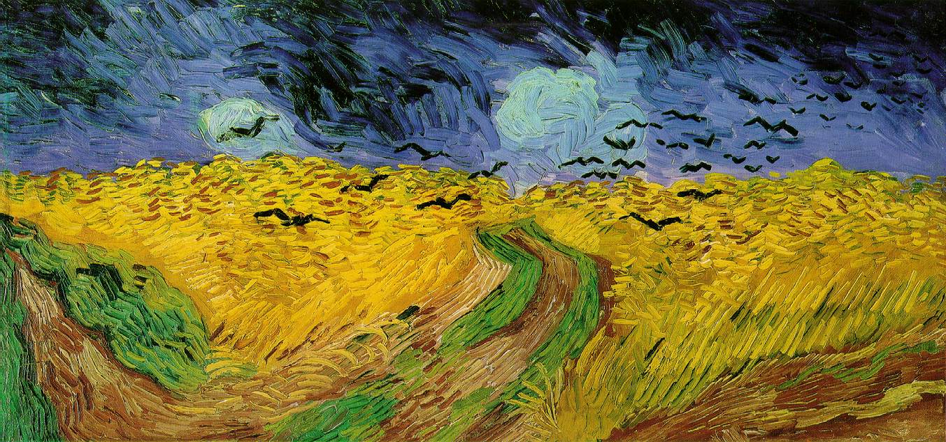
Vincent Van Gogh means to me vivid color and interplay of detailed strokes and dots that express texture and create the intricate ordered patterns that then become his very unique paintings. Swirls, circles and hatch marks are employed to create unique stylized elements. Van Gogh mastered color by painting lively complementary colors side by side. Complementary colors are colors from the opposite sides of the color wheel. The opposite of blue is orange, the opposite of red is green and the opposite of yellow is purple. No color is perceived in isolation. The juxtaposition of complementary colors creates a contrast in which each color appears brighter, more vivid and powerful by their use together. With this dynamic, expressive use of color Van Gogh merged varying styles into an innovative, exciting and coherent whole.
This is illustrated in his Portrait of Pere Tanguy, 1887. Using impressionistic brushstrokes, Van Gogh combined symbolic flat-perspective Japanese images with a classically modeled subject.
He was not just rendering what he saw but using what he found in nature for his creative inspiration and his imagination. He was giving us original, exciting images and at the same time images we can recognize and relate to. Favorites include Starry Night, June, 1889, Wheatfield with Crows, 1890 and Flowering Garden, done in Arles in 1888.

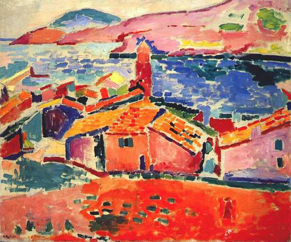
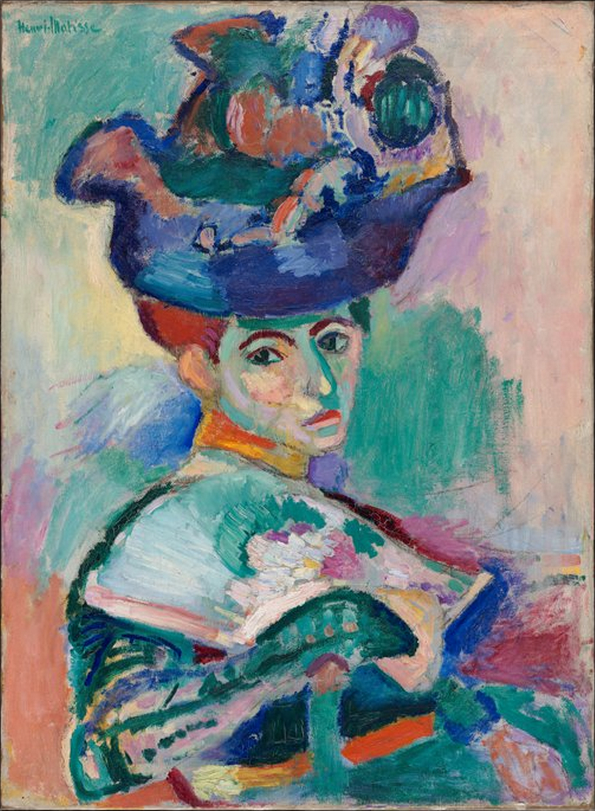
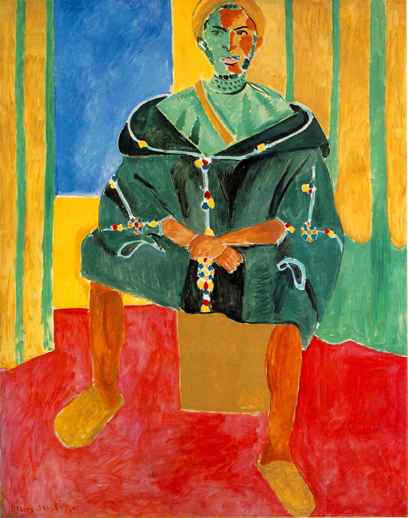
Henri Matisse means expressive use of vivid colors, interpretive, dynamic perspectives and wonderful, exciting patterns. I see broad strokes. I see small strokes. I sometimes see pointillism. Images are flatter, less modeled. Images are often given vivid colors without regard to their natural colors. I see images I can recognize, relate to but also I see whimsical, unique imaginative images that inspire and thrill me. Favorites include Portrait of Madame Matisse, 1905, Luxe, Calme et Volupte, 1904 Red Room, 1908, La Musique, 1939 and Woman in a Purple Coat, 1937.

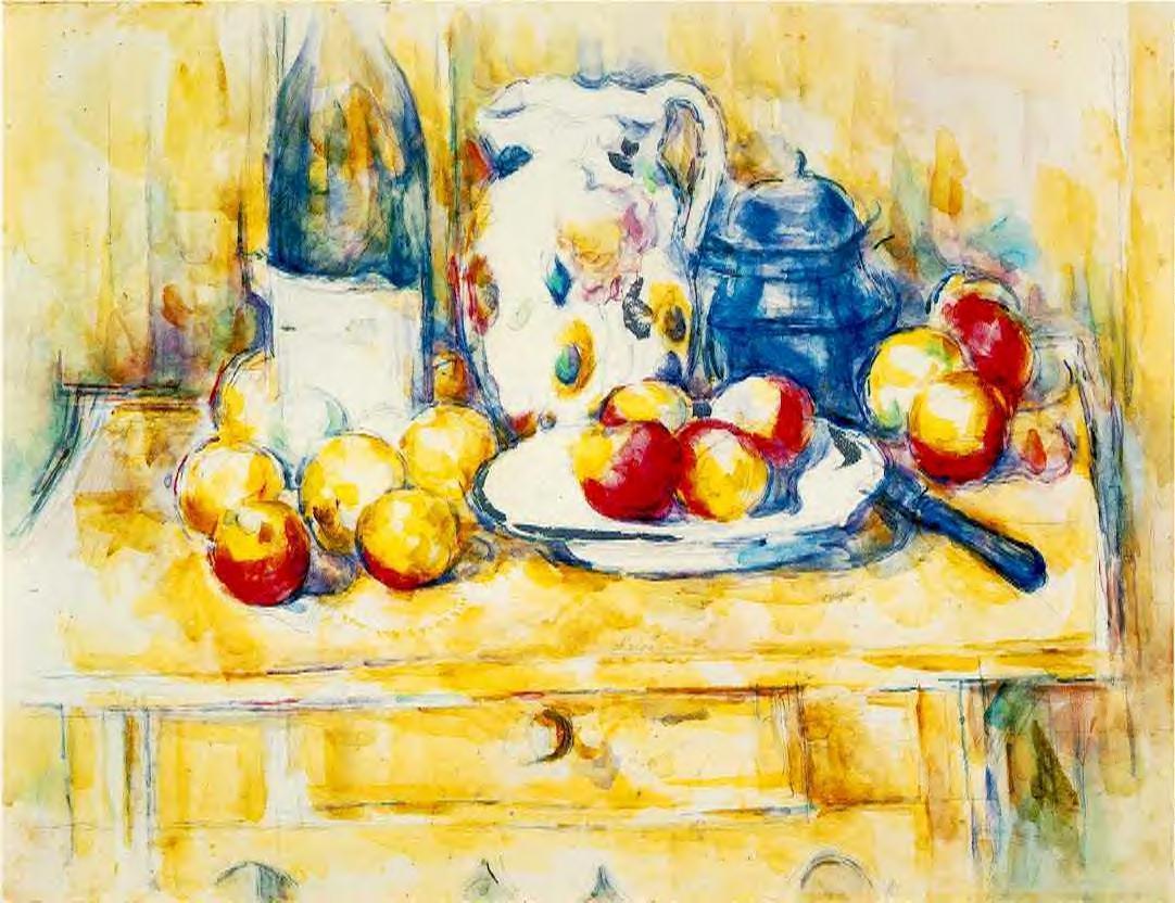
I learn by looking at Paul Cezanne. Distinctive repetitive brushstrokes build images. I see an underlying geometric order and planes of colors that are used to establish his design. Colors are softer, more realistic, but his colors still enhance the settings and objects of his paintings. Many of his images are also softer, airier and fresher, more translucent. Favorites include Mont Sainte-Victoire, 1904-1906, Madame Cezanne in the Greenhouse, 1891-1892, Still life, Table, Napkin and Fruit, 1895-1900 and Still life, Drapery, Pitcher and Fruit Bowl, 1893-1894.

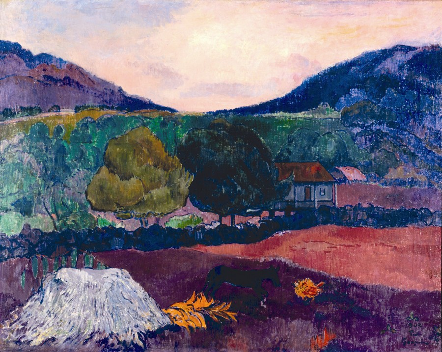
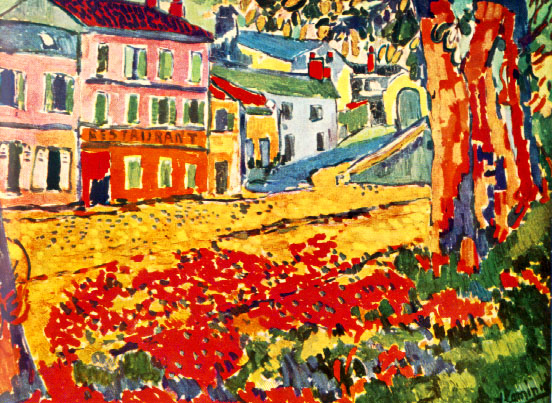
Paul Gauguin uses very vivid and contrasting colors and simple, direct designs in which the subjects are sometimes modeled but the settings are not. This creates an interesting composition with a powerful emphasis on the subject. The differing rendering styles within his paintings are brought together by the commonality of the bold colors that suit his choice of subjects. Inventive elements are combined with expected elements for a fresh approach that we relate to. Favorites include the Woman with a Flower, 1891, The Spirit of the Dead Keep Watch, 1892 and Joyousness, 1892.

I also love the brilliant colors, bold images and imaginative patterns of the very exciting paintings of the Les Fauves coined by the art critic Louis Vauxcelles and meaning “the beasts.” Details were not rendered. Images were a means of expressing color, pattern and texture. Great examples are Andre Derain's Collioure le Port de Peche,1905, Boats at the Collioure's Harbor,1905 and Maurice de Vlaminck’s Restaurant de la Machine a` Bougival,1905.

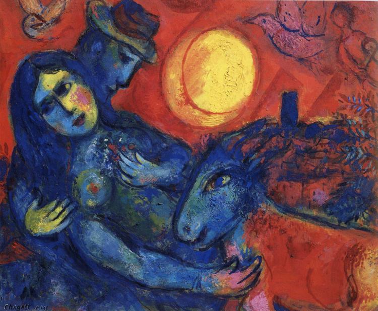
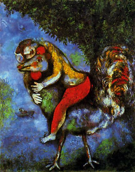
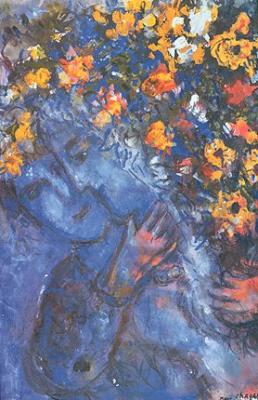
Marc Chagall takes a very colorful step away from reality. Many of his abstracted, whimsical images are composed into dream-like fantasies with objects and people floating in vivid color. Color is used to express excitement and energy in Circus, Horse and Rider. Warm colors are used to express the ambiance of romantic love in the painting Lovers and Flowers. Focus is created by the use of strong color in The Blue House and by the blue lovers in the just mentioned Lovers and Flowers. Amoureux au Bouquet and Mystere Matinal taught me to look for the imaginative opportunity in everyday subjects.


As a child, I always liked to draw. In the third grade one of my drawings was used on the program cover for May Day. I had what one typically called an eye and a bit of flair and inventiveness. One day I was wondering how to express these undernourished talents. I listened to an afternoon talk show that made the point that what ever you did as a child was an expression of your natural talent. Missing the point a little, I bought paints and brushes because I liked color. I stretched a very large canvas and proceeded with some false confidence in “my eye” to paint my first and very large painting. It was not too bad for a first effort. I discovered I really did not know how to paint. I decided to go back to drawing.

When I thought of pastels I thought of those wonderful portraits. At the local art supply store I discovered a very vivid and wonderful landscape-suited collection of pastels. I purchased it and just looked at the opened box of untouched beautiful colors for several weeks. This of course was not the reason I bought them so I decided to use them with some regret that they would not be as pretty once used.


                                            sold 
I quickly discovered with joy that pastels can be used in many ways. The colors can be applied with as much saturation as oil or acrylics or as translucent as watercolors. Pastels are natural for textural strokes and can be used on a variety of papers for still more unique effects. I use the softer Rembrandt and bit firmer Nupastels. I use the rounded ends of pastels, I use the corner edges of pastels, I break them depending on the size I need and use the sides of pastels. They are now colorful bits and pieces. You can use a kneader eraser to lighten, soften, blur or at line edges to lift and sharpen. These erasers are as important to me as the pastels and the paper. My closely guarded secret is you can use a kneaded eraser to remove and fix something you are not happy with up to a point. Pastels are a wonderful media for an evolving process of discovery and creativity. I frequently take a painting off the wall and add something.


I suppose no pastel needs to be finished until it is out of sight. A dear friend had as an overnight guest an artist whose painting was in her guestroom. The next morning she could detect the smell of paint. The artist had seen something she wanted to change in the painting and done so. My friend good-naturedly laughed and said "I had thought of it as my painting". The change was nice and my friend was very happy with it.
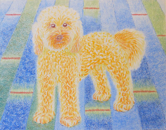
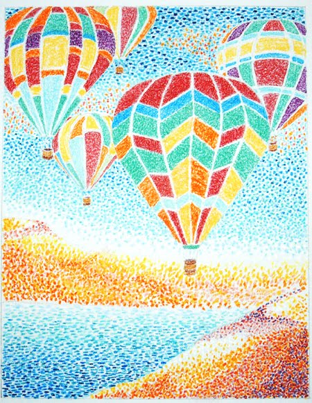
As a young child, I listened to my very creative mother say “Always have a surprise.” I paint images I like that give me inspiration. I will probably never paint a brown paper sack unless of course it is a desired element. It is from the process that I get ideas. I think of images as I draw. That is fun. As you can see I like bright colors, texture and some element of surprise. Some of my images come as ideas from things I see in my world, others are just made up.

I grew up in the exciting vividly colorful southwestern world of modern art. I live in the wonderful world of southeastern watercolors. I love both. My images are recognizable and airy like the watercolors and very colorful with some created elements like southwestern art. I think you learn from looking at good art and I have always tried to do that.

If you haven't yet, I hope you find inspiration and encouragement to buy your first box of pastels.

All images shown here are copyrighted and may not be used or reproduced without written permission.

Inquiries welcomed,

Natalie Claxton